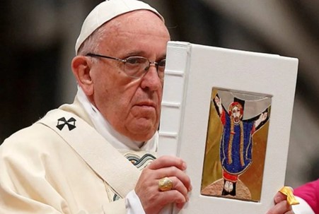
The affair seems to have floated down to a rest, with neither the Vatican nor the Jesuit order apparently interested in addressing the substance of the issues - that the Slovenian Marko Rupnik, the regime’s most beloved poster-boy for the VaticanTwoist cultural revolution created a personal harem for himself of women he manipulated into some grotesquely pseudo-religious sexual activities, too gruesome and blasphemous to mention in any company. He remains a priest - briefly excommunicated over one of the most serious canonical delicts (canonical crimes) a priest can commit, but forgiven because, we are assured, “he repented.” OK, I guess we’ll have to take your word for that.
Since then he’s been thrown out of the Society of Jesus for “disobedience” (no details offered), but his organisation, Centro Aletti, including the women’s “religious order” he founded to staff it, remains in place, with its members and his personal friends and defenders remaining in powerful positions in the Roman curia.
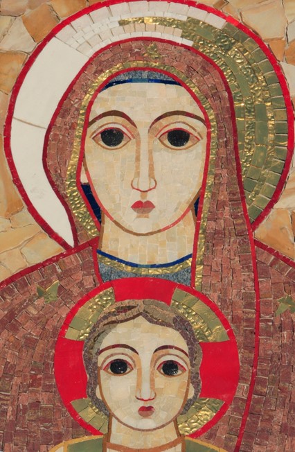
Even if you don’t know the name, you know his work.
What’s important to grasp off the bat is his immense importance as a public figure, as the artistic representative of the post-conciliar, Novus Ordo regime. His images are the gold standard for “iconic,” officially promoted, VaticanTwoist aesthetics. As such he is a celebrity in the NovusOrdoist world.
His mosaics are to be found on the facades and interiors of some of the most important churches in the Catholic world, including Lourdes, Fatima and the resting place of Padre Pio; it is printed on the covers of official Catholic publications ranging from altar missals to liturgical vestments and draperies to magazines and newsletters. If you have attended any Novus Ordo liturgical function anywhere in the last ten years, you are familiar with it. It’s very much the “official” art of the New Paradigm. Diocesan projects with turgid bureaucratese titles like “The Mission of the Church in the Modern World in Light of Vatican II” of the Perth diocese’s “Centre for Faith Enrichment,” love to use his stuff to illustrate their websites, for instance.
In Italy he is also famous for his preaching, his catechetical talks and lectures that appear, or appeared, regularly on television1 and are widely distributed on YouTube. He is, in short, a prominent mouthpiece of the New Paradigm’s ideology, a major player in the dissemination of its ideas to regular, pew-sitting Catholics, especially in Italy.
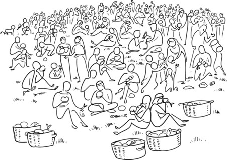
In 1966, Swiss artist Annie Vallotton was commissioned to create these and hundreds of similar stick-figure illustrations for, “The Good News Bible”. Given the quality of the “plain language” translation, these were indeed the ideal images for it.
Art by and for little children
We all know this kind of art, at least in a general way: it’s the art that tells us we’re stuck forever in the amber of 1969. Rupnik’s is the art of VaticanTwoism, the visual equivalent of Dan Schutte and the St. Louis Jesuits’ music. (And it’s certainly no accident that they’re both Jesuits.)
There’s so much of this style around that choosing a single example is like picking a leaf out of an autumn pile. The cover of this, I’m sure widely read, academic gem is representative: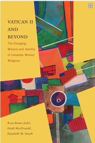
Fragmented images for fragmented minds.
What characterises it? In a single word? Childishness. It’s deliberately intended to look “primitive,” like art work from a kindergarten class: bright colours in big blocks, wobbly, mismatched or unparallel lines and angles, visual incoherence, and only vaguely representational - like a child’s stick figure portraits of his mother and father. This comported well with the social fad at the end of the 1960s to reject previous standards of behaviour and adopt a child-like, groovy, care-free approach to life, including religion. Rules, in art and religion, are for squares, man.
It’s worth noting that everything, both physical and virtual, published by the Synod leans heavily into this working premise. Twitterati regularly mock the Synod’s online propaganda for its almost parodically childish and incoherent aesthetics.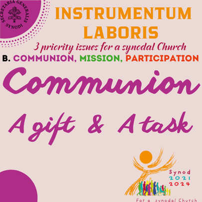
It is a style that came into vogue in the secular world - mostly in publishing and advertising - in the ‘60s. But it seemed to stick to the minds responsible for the Catholic Church’s material output like a remora on a shark. Its ubiquitous presence in the Catholic institution in 2023 serves as a visual signal that the ideas, aesthetics and purposes of the 1960s will be with us in perpetuity - very much the desired message of the regime. Despite the vast exodus of “the youth” from the pews, the adoption of the 1969-forever aesthetic is to this day vigorously defended in Catholic academia for “making the faith relevant” or “accessible.”
Why was Marko Rupnik protected so outrageously by the Bergoglian regime? Because he had to be. He is the living embodiment of the aesthetic end of the entire VaticanTwoist, New Paradigm project. He’s the visual propagandist for VaticanTwoism par excellence, and condemning him meaningfully for his crimes would be tantamount to condemning that project. Certainly they fear it would be perceived that way in the public mind.
If you know all this, it becomes impossible to be surprised that, as Diane Montagna Tweeted, Rome had no intention of endorsing the removal of his work from anywhere it was installed or used. “A meeting with top officials of the Vatican Dicastery for Communications ‘concluded that there was nothing to prevent the continued use of Rupnik’s mosaics. They said the work should stand on its own merits & be dissociated from the personal life of the artist.’”
A Twitter furore flared up when the Italian language Vatican.va website and Twitter page continued to use Rupnik’s art in their public offerings. What was not widely noted was that Natasha Govekar, a Rupnik disciple and key member of his organisation, is employed by the Dicastery for Communications as “Director of Theological-Pastoral Direction.”
Part 2 – The art itself told us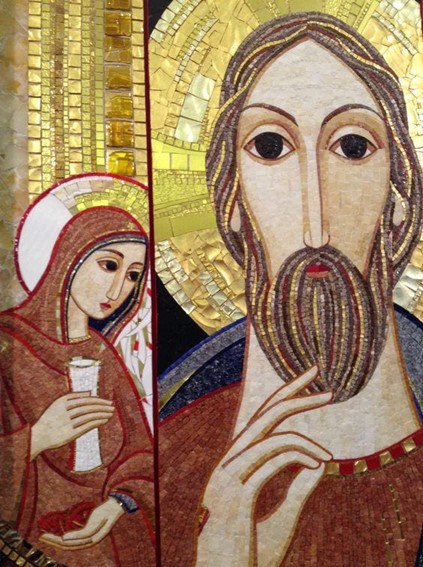
“His sexual obsession was not extemporaneous but deeply connected to his conception of art and his theological thought.”
The form is the meaning
The question of separating the man from the art is important, and gives us another hint as to why the higher echelons of the hierarchy, particularly in Rome where he was based, are so keen on continuing to use his work. His work is an expression of his perversions, which, if you know anything about Byzantine art and the history of Latin Catholic liturgical art since the ‘60s, makes perfect sense.
“His sexual obsession was not extemporaneous but deeply connected to his conception of art and his theological thought.” That quote comes from one of his victims of sexual manipulation and abuse, interviewed in Italian media2 and reproduced by Diane Montagna for the Pillar Catholic. In this case the work - which is essentially ideological, not religious in the Christian sense - can’t be separated from the man. The art is a perversion of Byzantine standards and is intrinsic to his perversion of theology that he used to justify and perpetrate his crimes; they are all of a piece.
The reason we have difficulty understanding this is that in the west, 500 years ago, we definitively separated the plastic arts - painting, sculpture and architecture - from liturgy. We divorced Christian art from its original intrinsic connection to Christian praxis. We value the art above our altars only for its visual beauty, and we judge that from purely subjective standards.
In Eastern Christianity icons are simply part of liturgy, inseparable from all Christian practice. One can have icons in the home for private devotion, but their value is derived liturgically, as expressions of the corporate worship offered to God by the Church. A home icon is considered a holy object - the equivalent of a sacred relic or sacramental - because of its connection to the liturgy.
Since the Renaissance we have abandoned this fusion and our sacred art has been permanently separated from its expression as part of the liturgical actions of the Church. Paintings above altars became a matter for fashion and taste. This worked - sort of - up to the point where the Church followed this by abandoning her liturgy as well.
For 500 years our paintings and statues have been made as expressions of the personal feelings of the painters and sculptors (and commissioning clients). Now we have the same thing in liturgy; the Novus Ordo liturgy, with all its options and rubrical laxity, has become a canvas for personal expression of clergy - or more often, parish liturgy committees. This is how we got a liturgy that now nearly always expresses a theology at variance with the content of the Faith.
In a word, we’ve forgotten what sacred art is and is for, and that you can’t separate it from the intentions of its creators.
His work isn’t Byzantine; it’s a parody and perversion of Byzantine
Remember “Hagan lio”? These people literally worship chaos, disorder and anti-rationality. Their methods are subversion and transgression of cherished expressions of meaning. That’s why Rupnik’s disordered art, and disordered lifestyle, disordered theology and disordered psychology are all of a piece.
What does that mean? To understand the transgressive, subversive nature of Fr. Rupnik’s work, it’s necessary to understand the style he is parodying. Most people with normal minds look at his mosaics and have a vague sense of wrongness and unease. They are clearly intended to look like ancient Byzantine art, but it’s off, anti-true, somehow. The ubiquity of the black void of the eyes is often cited, and is the most obvious aspect of the wrongness.
But in fact his work follows a trend - popular in powerful Church circles since the 1970s - of faux primitivism. It’s meant to ape not the forms and canons - the rules - of Byzantine art, but its ancientness and “primitiveness” to modern sensibilities.
This isn’t an imitation of Byzantine art; it’s a parody of it, mocking its “primitiveness” to post-Renaissance western eyes. It is the work of a man with a diseased mind and disordered will, mocking and deriding his elders and his betters.
True Byzantine art intends to convey the holy, good and true in all its ultimate perfections, even when it looks a bit rough because of its age or the limitations of the times and places it is created.
The ring of truth, antiquity and authenticity in these images, however “primitive” their execution, are a far cry from the smirking mockery of the style by Rupnik.
A 1500 year old Egyptian or Ethiopian Coptic chapel looks “primitive” to our machine-spoiled modern eyes. As with all things made by hand, the lines are wobbly, the natural pigments faded, the plaster of the fresco might be chipped and fragmented. But the work itself was intended by its ancient creators to convey meaning in a precise visual language they knew how to use.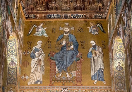
Palatine Chapel, Palermo
Their aim was the carefully exact expression of universal, timeless realities, absolute perfections of God, using a precise symbolic visual language in which both they and their intended viewers were fluent.
Rupnik’s, on the other hand, is art that is deliberately theologically and aesthetically transgressive. It aims not to illustrate or even didactically explain Christian theological ideas, but to distort them. In fact, by taking those visual expressions of Christian theology - by using the traditional Byzantine visual theological vocabulary - it accomplishes the same goal as verbal theological modernism: it uses the same “words” - visual forms - to mean different things.
It uses that sacral language to de-sacralise what it’s talking about. It takes the extreme precision and rationality of Byzantine Christian art and creates chaos with it, visual gibberish. Its style, by imitating children’s scribbles, implies that the Christian things it depicts are silly, imprecise and ultimately irrelevant nonsense, stories fit only for children. Rupnik’s art is deliberately subversive of its source material, anti-rational and anti-mathematical.
Here’s what I mean: this is his work on the façade of the Basilica of Lourdes: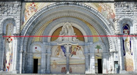
A major feature of 1970s Catholic faux-primitivism is deliberate asymmetry. Traditionally the lines would match up and make geometric visual sense. But his lines are wonky, and tell us nothing. (I’ve added the red lines to make it clear.) The Christ of the baptism on the left is apparently randomly lower than that of the Christ of the Transfiguration (maybe?) on the right.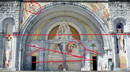
More examination of this façade shows us that the composition’s randomness and chaos is obviously deliberate, and deliberately subversive of both the Church’s traditional Christology and the (highly symmetrical, mathematically precise and symbolic) Neogothic architectural features of the building. It is not Catholic Christology and Gothic architecture, it’s a deliberate mockery and subversion of it.
His lines and angles are deliberately imprecise, broken, fragmented and randomised in ways that one doesn’t even find in nature, let alone in the formally mathematical rational mind of medieval western man or medieval and Byzantine sacred art. Angles that go nowhere and point to nothing, and are apparently added for no other reason than to throw off the flow of movement from figure to figure.
Visually and theologically this is just a mess. Why are all the angles and lines of direction random and asymmetrical? Why is Christ pictured in every section off to one side as though He were not the purpose? What is the message here? That there is no symmetry or orderliness in the divine constitution? That Christ is not the centre, but is just one of the players in the story? Has no one ever asked?
Here is a closer look at that Transfiguration mosaic: (or maybe it’s supposed to be a Pantocrator3, hard to tell…)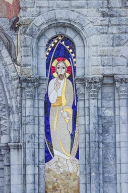
You might say that it’s just a normal depiction of Christ in a “mandorla” - the traditional almond shaped form that represents the doorway or opening from this world into heaven - holding His hand in a standard Byzantine blessing. But look again.
The mandorla in traditional Byzantine and western medieval art is a mathematically precise geometric form and symbolises the ultimate perfections of God and the heavenly realities.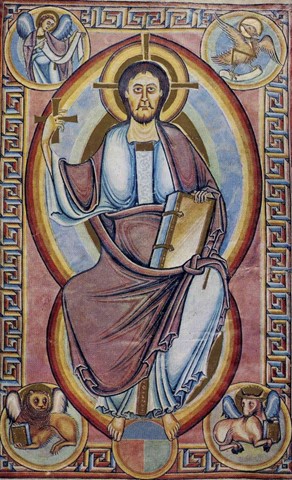
Romanesque manuscript page, 11th or 12th century, showing Christ Pantocrator in a mandorla.
But what are we given here?
Rupnik’s form not only doesn’t show mathematical precision, it is deliberately broken, imbalanced, fractured and haphazard. A heaven not breaking through with its perfections to this random and chaotic natural world, but broken and dissolved, defeated by it. And inside it, where normally we glimpse the golden glories of heaven, there appear only the blue of the natural sky of this world, and some disturbingly broken, random shapes that could be black and jagged rocks.
If you know what a mandorla is supposed to mean, you can read this message: this depiction is a conscious repudiation of that meaning, a negation of it. The mandorla is broken, uneven, random; it means that God’s reality is not perfect or final. There are unknown, unpredictable hazards even in heaven, and even God Himself cannot be fully trusted.
Subversion as ideology
If you look at liturgical art of the Post-Conciliar period - not just paintings, sculptures and mosaics, but altar furnishings, vestments, architecture, etc - it's all of a piece. It was a style invented in the late 60s and deployed in the Church at the same time and for the same reason as the new liturgical rite. It was intended specifically to be transgressive, to literally make you feel off balance, out of kilter.
Everything has to be asymmetrical, forms that have no relationship with each other, lines that go nowhere and stop abruptly, that are double or treble but never parallel, corners and angles that don't meet, irregular edges that fail to show coherent forms, and corners that are never square. All this might be defended by those ignorant of Byzantine canons as “self-expression” or by the standards of modern naturalistic representational art - Impressionism, etc.
But that’s not what it’s presenting itself to be. It’s presenting itself as an “updating” of Byzantine Christian sacred art, and expecting us to not notice.
But real Byzantine Christian sacred art is so precise it’s able to be mapped mathematically: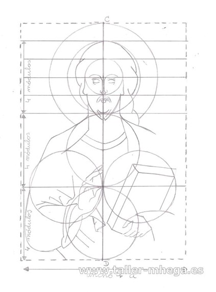
And deviations from these precise canons - rules - are just that; deviations, departures, mistakes to be avoided as much as skills and available tools and materials permit. Byzantine artists strove to match their work to this precise ideal, not to deliberately subvert it.
Rupnik’s work is a childish rebellion against philosophical foundations of Christian thought, that whole body of metaphysics that says real things are real and not subject to our personal whims and preferences. It should not have surprised anyone that his perversion of these traditional artistic forms was matched by other kinds of perversions.
Latest from RTV — VATICAN II, 60 YEARS LATER: Can You Handle the Truth? (includes never-before-seen vintage video)